After quite a year, we can all finally say it is over. To help with the sendoff, we held a December MCprep Content for creating card renders or short animations, cheering for the new year. A big applause for all who entered, with winners added to the Hall of Fame!
Winning Card Entries
With this contest, there was a single category but room for three winners. Judges cast their votes based on the following criteria:
- Overall production quality | This includes animation polish (if relevant), composition, and any other techniques that add to the overall production quality and aesthetic.
- Quality Holiday Card | All entries should be able to stand on their own as “cards”, use of text / overlay messages is encouraged, but is not required and also shouldn’t distract or overpower the render itself. You are free and encouraged to add text, seasonal borders, and framing like you would expect on the cover of a card you’d give to family or friends. Don’t be afraid to “tell a story” too, but it’s ok if it doesn’t!
- MCprep basics | Are your materials non-blurry? Did you utilize meshswap? Are you using a variety of mobs (including self-made) or item spawning? Do you have good MC sky lighting, or light-emitting blocks from meshswap spawner? Show off what you learned bit.ly/MCprepTutorials!
- Originality | Don’t just make the first thing that comes to your head, think of something creative or unique! Make your card stand out from the crowd.
Winner: Kuco Enciso
The Santa waving, along with background looping elements like the fire and tree blinking, is the perfect example of what an animated card should look like! Plus it has a great overall production quality, with many assets from MCprep such as item spawning and meshswap.
Winner: Neo
Neo definitely had an original idea with this scene sequence. While in a way it feels less “card-like”, the entry makes up for it through originality, scene setup, and fun details like the slip and fall at the end.
Winner: Breadcrumb

This render looks great! A nice style comes through with clearly intentional colors, and nice lighting around the characters. Plus the text itself sells it as a card. I had to take a moment to decide if it was too inappropriate or not? But hey, it’s funny and quite memorable, great job.
All New Year Card Entries
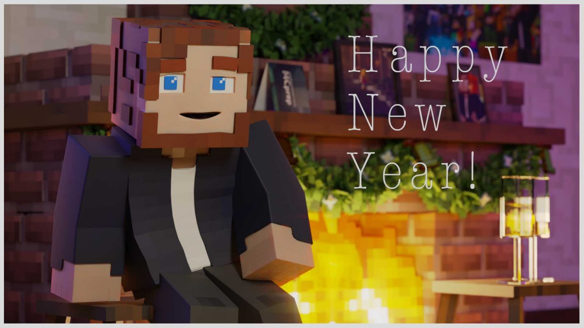
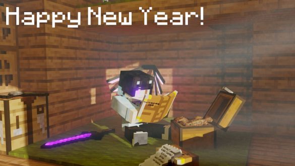
By BenMH02 (YouTube)
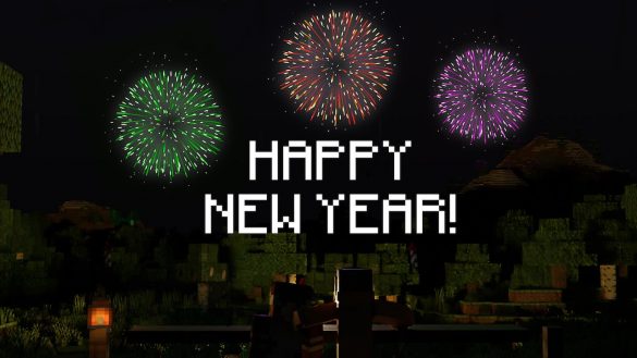
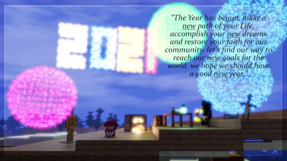
By Kuco Enciso (Instagram)
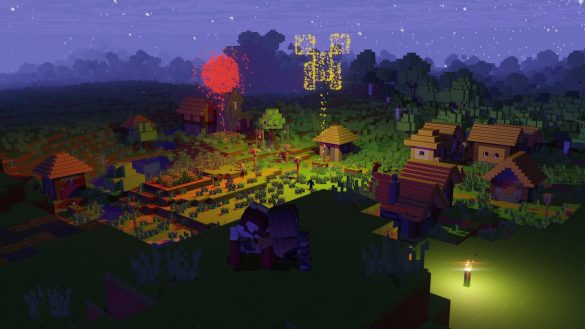
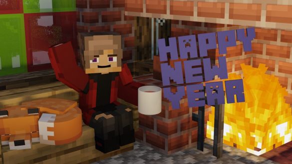
Credit to viegasvirus (YouTube)
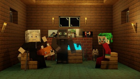
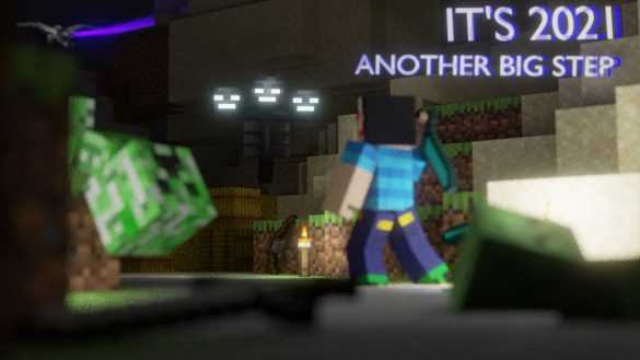
By Neo (YouTube)
